Sunday, 28 October 2018

Rare original artwork for Where Eagles Dare up for auction

Auction house Heritage Auctions has recently hosted some incredible original artwork by artist Frank McCarthy for Where Eagles Dare. The 6 pieces come from the collection of our good friend, David Frangioni, author of Clint Eastwood: ICON (Here) 
With each concept painting for Where Eagles Dare, artist Frank McCarthy was getting closer to the idea that would be finally used on the films one sheet. On these original paintings, the style of the cable car was significantly altered to match that of the one in the actual poster. Richard Burton is still the only star shown; however, both Clint Eastwood and Mary Ure would be added later, on top of and leaning out of the cable car with machine guns blazing. The Nazi soldiers are still falling to their deaths and the Castle in the background is still exploding. These incredible action packed pieces of concept art shows virtually no signs of handling or usage. This painting is on a flexible mylar or acetate and are in near mint condition.
Like most collectors, David is reluctant to part with any of his collection, however as David explained to me ‘space’ is that all too familiar enemy. David is also selling some other incredible Eastwood collectables – so be sure to check them out HERE 
Above: This wonderful piece was used on the international promotional posters primarily as the background as seen on the International title card. This piece has two photographic elements in the cable car and the castle, and it looks as though the original painting was expanded with attached panels at the top and on both sides to include a larger background. 
Above: Amid the twisting cables of the tram and the falling debris of the destroyed castle, Richard Burton leaps to the safety of the only cable car still operable. This incredible concept painting for Where Eagles Dare by Frank McCarthy captures the highlight of the movies daring escape.
For full details and dimensions please visit Heritage Auctions HERE 

Thursday, 25 October 2018

The Mule Original U.S. 1 sheet poster

So here we go, here's a first look at the U.S. One Sheet theatrical poster for The Mule. It's so good to see Clint's image back on the poster art. It cleverly captures the sense of a drug run with the truck on a lonely road and the central image being a side profile shot of Clint. I think it works rather well actually. This of course is a teaser design with the coming December 14th date at the bottom. I don't know if the design will change later for the regular release poster, but it would be nice to see an additional different design - only time will tell. It certainly ramps up excitement, roll on December.!

Tuesday, 16 October 2018

Clint and Ali MacGraw at NATO awards follow up


For anyone who took an interest in the photos of Clint and Ali MacGraw at the NATO 1971 awards ceremony (below) and the accompanying text - you may remember I said that I would be contacting The National Association of Theatre Owners in order to try and obtain some more information. Thankfully, I reached two incredibly helpful ladies who were both wonderful. Firstly, Vice President and Chief Operating Officer Kathy Conroy picked up the story and pulled in Executive Assistant and Office Manager Cheryl Dickson. Cheryl does an incredible job which ties in with the educational side of the Association for in-theater materials and on various aspects of the exhibition business.
Cheryl really came through on this by attaching these ‘photos found in the NATO convention photo files of Clint Eastwood along with Ali MacGraw receiving an award in 1971.’ Cheryl added, ‘The photo does not specify the name of the award.  However, we did find another photo of both of them in NATO’s 1971 Encyclopaedia of Exhibition on page 134 referencing them as “NATO’s Stars of the Year”’.
What an amazing find. Cheryl was kind enough to not only include the 2 super photos of Clint and Ali with their awards but also the all confirming ‘page 134’ – a great full page advertisement in celebration of their awards.
I really have to send a big thank you to both Cheryl and Kathy who not only made the effort, but most certainly came through.
If only all Associations and Organisations showed the same level of commitment and effort. 
Thank you so very much ladies    

Monday, 15 October 2018

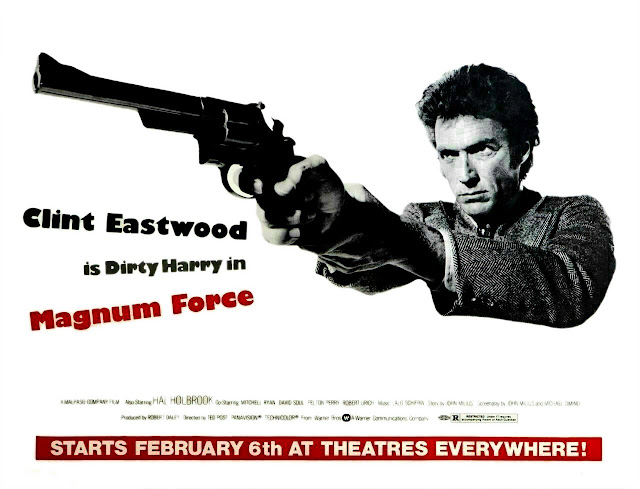
Exclusive Ultra-Rare Magnum Force U.S. Subway Poster

Last week I was contacted by our good friend David Frangioni. It’s always good to hear from David, and it usually means there is something incredibly interesting to discuss This time around it was in the shape of this incredible and ultra-rare U.S. Subway Poster for Magnum Force. 
This was an amazing turn up, it was certainly new to David who had never seen one before, it was new to me and a few other friends and collectors I know. It’s been quite a Magnum Force year for David, as you may remember he was lucky enough to obtain another very rare poster earlier this year, the Magnum Force Christmas Teaser (click here). 
The subway poster is an incredibly beautiful thing. In fact, David obtained this privately from an old friend, so it is highly debatable that this poster image has ever been seen on the internet before now. It’s size is a huge 45” x 60” and would look stunning if displayed.
Of course, David is no stranger to these beautiful posters. His book: Clint Eastwood: Icon: The Essential Film Art Collection (left) is still the definitive publication when it comes to Eastwood artwork. Sadly, these two latest Magnum Force posters came along shortly after the latest 2018 publication deadline of his book – but they are certainly reflective of the magic that can be found between its pages. 


It is also a significant reminder of just how quickly the market can evolve and perhaps a reminder of what is still available out there – it never fails to equally shock and surprise! If you haven’t discovered David’s book yet, be sure to check it out – it’s a magnificent testament and the ‘bible’ when it comes to Eastwood poster art. Check it out here.


I would like to thank David for handing us this beautiful high resolution photo of the incredibly rare subway poster. It is always a pleasure.

Friday, 12 October 2018

Flashback: National Association of Theater Owners Awards 1971

The National Association of Theatre Owners (NATO) is the United States based trade organization whose members are the owners of movie theaters. Most franchises of the worldwide major theater chains are members, as are many independent theater operators; collectively, they account for the operation of over 32,000 motion picture screens in all 50 U.S. states and 81 other countries.

In 1971 the awards were held at The Waldorf Astoria Hotel in New York City. Actress Ali MacGraw was in attendance and was enjoying a wave of success after the film Love Story. She was accompanying her then husband - film producer Robert Evans. The following year she made The Getaway with the late great Steve McQueen who she would eventually marry in 1973.

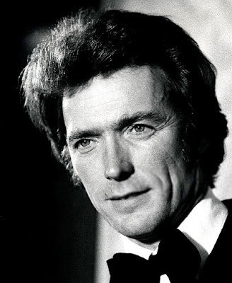
During the NATO awards, there were some great photos taken of Clint and MacGraw talking together as well as some terrific individual shots of Clint. You may notice in a couple of shots that Clint is pictured with some kind of award, a piece of glassware. To this day I have never been able to find out what this award is or what it was presented for? I took the steps today to contact NATO in the hope that they may be able to reply with an answer. Whilst I have many lists of Clint’s awards, this one seems to be incredibly hard to find, regardless of many hours of internet research. 
Let’s hope that NATO can provide us with an answer.
Update: I recently discovered this rare trade magazine (Boxoffice magazine November 15th 1971) which covered this on their cover page. The information at the bottom of the cover also dates the event as October 28th - resulting in the first time we have been able to accurately date this event.

Thursday, 11 October 2018

Clint Eastwood Rare Radio Promo Jan 3rd 1967


I was recently sent this incredible radio interview recorded on January 3rd 1967. Originally broadcast on the Canadian Radio Show 'Assignment' – Clint is interviewed by Bill McNeil. It’s a really wonderful discovery. 

It is evident that this was not a pre-recorded open interview as Clint refers to McNeil by name and mentions Canada. So it was obviously part of the promotional tour which Clint undertook and would see him arrive in the UK just 5 months later. There is also a reference to Bond (Thunderball). 

It’s also interesting that Clint does not mention either of the two sequels, For a Few Dollars More and The Good, the Bad and the Ugly, both of which were already filmed and in the can by this point in time.

It makes for a fascinating insight and presented here purely for educational purposes


Thursday, 4 October 2018

The Mule Trailer

So here we are already with Clint back in front of the camera as well as behind it. First impressions among some friends are generally positive and it’s great seeing Clint still looking well. It’s a nice tease – with some great touches of humour and a glimpse at some dramatic action. I would still like to know who is scoring the film. Did anyone else pick up on the trailer music? It sounds very much like Clint on the piano and if my ears are still in tune, it sounds very much like the motif used for A Perfect World. This of course could just be a temp track exclusive for the trailer.
So, enjoy this brief preview of what is to come later in the year  .
             

Wednesday, 3 October 2018

The Making of Gunnery Sergeant Thomas Highway

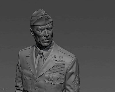
I recently had the good fortune to discover the wonderful work of Stanislav Klabík. Stanislav is not only a very talented individual but he also happens to be a big fan of Heartbreak Ridge. I was lucky enough to contact Stanislav who kindly told about his work. Among his 3D modelling, Stanislav also produced some striking images – all of which just had to be seen. But firstly, I’ll let Stanislav explain his story:
Hi all, my name is Stanislav Klabík and I would like to show you the process of making of my latest personal project named "Gunnery Sergeant Thomas Highway".
I really like the movie Heartbrake Ridge where Clint Eastwood plays a really tough drill instructor who is in war with marine corps in his platoon so I decided to make a some nice portraits of him.
Modelling - I used a simple head model for the first modelling. When I was satisfied with the result, with the base proportions of Eastwood´s face, I used this high-poly model for modelling a new topology with using the great Polyboost scripts. I used a bit heavy polycount for his head to achieve all major proportions of his face, because I planned to make some facial animations.

Then I made a simple rig for the head and turned his head to different position, and then I took this model to Mudbox and added all details like wrinkles, pores etc. I didn´t used the displace for final render, because there was a huge difference between the FastSkin + Displace and between the FastSkin without displace implemented, don´t know why, but these shaders looks totally different in quality despite the same settings. The hairs and the facial fur like the eyebrows etc. were made using the incredibly slow Hair and Fur using a several maps to modify the hairs placement, length, thickness.
Then I started a modelling of the cloths, I used the same screens from the movie as for the head. The hardest part were the ribbons and his badges, because I am not skilled in marine corps awards and the screens were too small to see what awards he has, I spent quite a long time with looking on the screens and with searching for right awards using right words via Google.
 
The metal badges were modelled really quickly, I used googled images, tweaked them a bit in Photoshop and then used them as a stencils in Mudbox. Then I tweaked the model for better shape and details, exported selected polygons and that´s all, really quick way how to do these types of things and with great quality.
Background is based on the movie too; I changed only some small details. Some peoples were confused why I used so many polygons for windows and some other parts. That´s was beacause of quality; final render was a bit blurred because of DOF, but there were a difference between the renders with background with sharp-edged objects and between the background with chamfered and smoothed edges. And I want as much quality as possible so I that´s why I used so many polygons for this simple background.
Texturing and Materials - I did texture only for head and ribbons, for head I used colour, specular and bump map. I used only overall colour slot in FastSkin material, but you must know what you are doing when you are using only this slot. I used only one color or the mix of two colours for the rest of the colour slots in FastSkin material.
When I matched all colour tones of his faces I did the rest of the maps. Textures for ribbons were really simple, only colours, everything else were made in geometry.
For clothing I used again the FastSkin material with simple cloth texture with pattern, this provide the soft look and together with the small strong bump provide the soft fuzzy look.
Eye use FastSkin together with the Raytrace material for the outer shell of the eye. Settings for the reflections are quite similar as Max Edwin has in his Song Hye-kyo project.
Lighting - I used area lights; on the screens you can see their positions. The left side windows and the right side windows simulate light coming from the both sides of the room, everything is the same as in the movie. Warm bulb light simulates warm light coming from above. Back window simulate the light coming from window behind him. Light uses the raytraced shadows. 
Rendering - I used Mental Ray for character and Vray for background. I am not skilled in mental ray interior rendering and I didn´t want to waste my time with mental ray for interiors so, I decided to use Vray and match both scenes settings. For character I used camera with 130mm Lens. 
Post - Production - In Photoshop, I did lot of tweaks to achieve a little bit specific look of 80´s movies. I tweaked the colour balance, added a grain, a little bit of chromatic aberration and at the end I added lens flare effect using the great Knoll Factory tools. But all the effect is only a small and decent, because bad use of lens flare can kill your render sooner than you blink. I also added tiny facial fur, and tweaked some details.
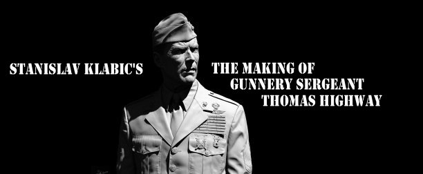
This was quite an old version of the project, the black and white version (below) is a recent reworking and improved version.
I can't help thinking how wonderful these b/w images would have worked as alternative poster designs, they're incredibly striking. My thanks to Stanislav for allowing us to share this beautiful work. Be sure to check out his work at ArtStation here 
Thanks also to Kevin Wilkinson